The innovation and technological development of computerized printing has rendered the production of books increasingly accessible to broader circles. Today, in the age of omnipresent PCs and printers, the book is one of the most common things we have.
Undoubtedly, therefore, the almost instinctive appreciation of former ages for the correspondence between the dignity of a books contents and the meticulous craftsmanship devoted to the production of the book in general and to its calligraphy in particular, that is, book production both as an art form and a truly spiritual experience, has almost, if not completely, vanished. This refers, sadly, even to those books that, by their very nature, should inspire such instinctive appreciation in virtue of their spiritual orientation.
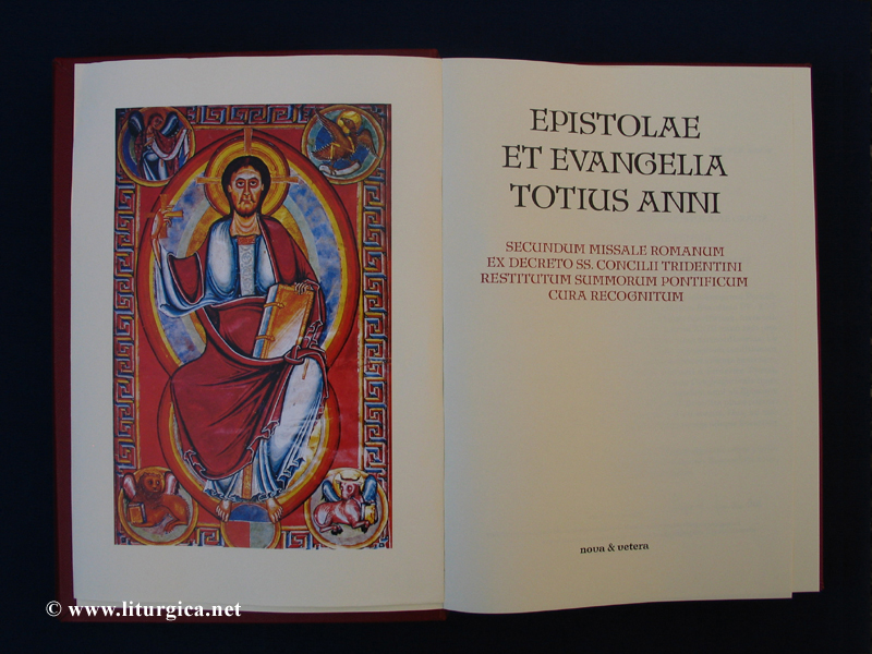
In the middle ages, a book was the result, primarily, of an intellectual effort; therefore, its intellectual value was more readily recognized. Because a book was hand lettered, something of the spiritual character of each books content flowed into the form of calligraphy used to produce the particular book. Hence, the book itself, and the very act of producing the book, participated in the value and honor of the spiritual dignity ascribed to the book. This was especially true of those books produced for the liturgy. These, after all, embodied something of the gifts bestowed by the Holy Spirit. The liturgical book, therefore, became a symbol of Christ deeply experienced as a living Presence. Hence, the Evangeliarium on the altar was honored in the same way as the cross of Christ. It was solemnly borne in processions. Throughout all Church Councils, ecumenical and local, the Evangeliarium rested on a chair as a symbol that Jesus Christ himself was enthroned on that chair. Even in secular courts, the Evangeliarium was present before the tribunal, testifying to the presence of the Eternal Judge. It was inconceivable that an important oath be taken without the Evangeliarium. Because of its character as a symbol for Jesus Christ, the Evangeliarium was produced only by specially chosen scribes, on specially chosen materials, and was even stored specially. Whoever wanted to touch it had to uncover his head and wash his hands before doing so. The great dignity formerly attached to the Evangeliarium, today in the form of the Lectionarium expanded by the epistles, has been maintained nowadays only in the Churchs rubrical legislation. The Evangeliarium is kissed and incensed; and, if it is carried solemnly by the deacon, he is not required to make any other kind of reverence: not toward the bishop, as Christs representative, nor even toward the tabernacle, as he is considered to be carrying Christ in a real symbol already.
|
The first step: Preliminary thoughts about the font
Thus, when planning for this edition began, the question of the font immediately arose. Required was a font wholly adequate for the holy text, a font instantly recognizable by the viewer as uniquely and naturally designed for the transmission of the sacred.
In the twentieth century, most Missals used the many variants of the large font-family Antiqua that we all know - sometimes with tiny aberrations - and read and use on our own computers: Times New Roman (Windows-PCs) or Times Roman (Apple-PCs). Until the 1970s, there were many competing fonts; but nowadays almost all texts are in the Times (New) Roman font. We find this font in newspapers, magazines, books, manuals, advertisements, here on the World-Wide-Web, and we ourselves use it for all of our personal and business correspondence. The Lectionarium, however, embodies something given to us by the Holy Spirit. It is obvious, therefore, that in our time it would be absolutely unacceptable to use this common, yes even banal font for a sacred book. This would be as incongruous as a priest ascending the steps of the altar to perform his sacred ministry attired simply in his street clothes.
|
|
Choosing and Making the Font
Our search for an adequate font quickly led us to the Missal that, in a manner unparalleled since the innovation of the art of printing served the objective spirit of the liturgy: the so-called Laacher Missale or Editio Lacensis (1930).
As a former librarian and, therefore, a man especially familiar with books, Pope Pius XI was presented a copy of Saint Augustines Civitas Dei published by the Bremer Presse, at that time universally acknowledged as the premier and most prestigious of the German noble printers, called Presse. The Holy Father highly praised the publication and urged them to publish a Missal of similar quality.
The Protestant publishing house accepted the Popes suggestion and went to work. For liturgical guidance, the publishers were quickly referred to the Monastery of Maria Laach, at that time, the leader of the Liturgical Movement in Germany. After years of tireless effort, a Missal evolved for which utmost care had been devoted even to the smallest of details: a true work of art that stands head and shoulders above all other editions of the Missal in the twentieth century, and has set the gold standard for liturgical publications in many other ways as well.
It would be far too difficult to describe here, in detail, all the superlative qualities of this edition of the Missal. Its beauty was especially notable in two essential elements of the fine art of printing: the font and the typesetting, both of which were carried out to perfection.
Not surprisingly, a new font was cut for the Editio Lacensis. The publishers had discarded the Antiqua-fonts as too commonplace, and they looked instead for a font that, in every aspect, would embody sacral imprint and, therefore, could only be used for liturgical texts. After long and careful studies of medieval calligraphy, a font was finally cut that was based on the early medieval Minuskel, the clear and powerful font that was used to hand down (i.e., traditio) the holy books of Christianity. But although this new font derived from the Minuskel, it did not copy it. It is hard to imagine, but the entire font had to be cut eight times until the editors were satisfied with the result. Each time about 1200 characters had to be cut, and they were cut according to hand-drawings, not from patterns designed on a drafting board. There are still entire files of correspondence exchanged regarding the composition of a single letter!
In this way, finally, a font was cut that was supremely suitable for the holy text, a font the viewer instinctively senses as sacred. Clear and strong it stands forth. During the entire process, comprehensive tests ensured that it was also easily readable in bad light.
Until now, this font had only been used for the Editio Lacensis. It disappeared during the chaos that ensued from World War II and was lost, as were most of the copies of this outstanding Missal. By an enormousness effort, demanding hundreds of hours, this font has now been cut anew and, therefore, can be used again, for the very first time, for this Lectionarium!
|
|
Guiding Principle for Typesetting the Lectionarium
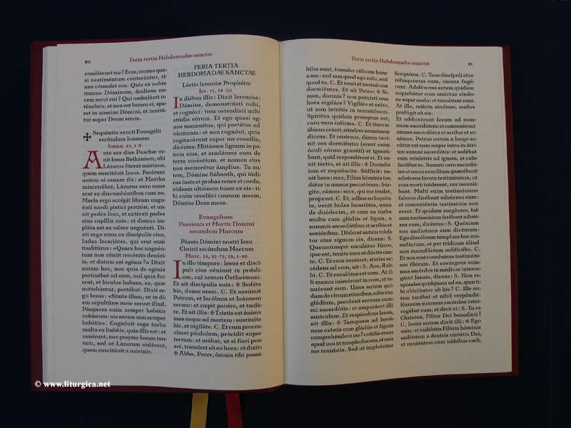
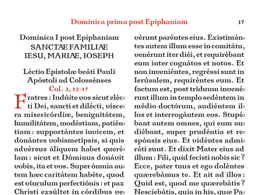
Besides the font, the outstanding achievement of this edition of the Lectionarium is its typesetting. The beauty of typesetting consists mainly in its evenness and regularity. These are assured not only by consistent spacing, the refinement, ideally, to only one font size on each double page, and numerous other considerations, but principally by the consistent filling of each individual line. The typesetting of a liturgical book, traditionally in two columns, is an extreme challenge for the typesetter. Because of the impossibility of arbitrary hyphenations, as well as the brevity of the lines, it is sometimes very difficult to avoid broad blanks or white places between the words in a line. Unfortunately, these white places have been common in liturgical books. And while looking over many lines in a block, these white spaces develop into the infamous streams, mostly diagonal but sometimes also vertical. For typesetters, these streams are considered one of the mortal sins: i.e., they complicate reading and distract the eye. Many, yes most of the editions of the Missal during the twentieth century put great value on loosening up and decorating the pages with illustrations and adorned initials. But as regards the actual typesetting, no great effort was extended. Thus, the typographic quality inside these Missals was extremely disproportionate to their outer appearance.
The edition of the Civitas Dei published by the Bremer Presse is still recognized as one of the outstanding achievements in the art of typography. It is therefore completely understandable that, gazing upon this masterpiece, Pope Pius XI would express the desire to see published a Missal of comparable quality.
|
|
The accomplishment of the typesetting
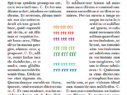
That the usual mistakes had to be avoided while typesetting the Lectionarium goes without saying. But to match such an outstanding degree of evenness in the spacing of the lines, it would not do simply to let the texts flow into the columns and leave the rest to the computer! Each individual line, and very often every single word, had to be corrected by hand. Thus, the font contains different versions of the letters that are used, depending on the particular circumstance. For example, there are three different versions of the minuscle t: a normal one, as used in most cases; an especially narrow one used, for example, for the beginning of every double t; and an extra broad version for use before each punctuation mark and at the end of a line in order to achieve a visually pleasing closure. Naturally the objective is that the reader, at first, does not recognize these differences. Indeed, it is characteristic of this particular font and typesetting that they look entirely natural, exactly the way it ought to be.
Upon close inspection, however, and while comparing the characters, the several different versions will be recognized. This variety is not simply because the new font approximates the natural vitality of handwriting; even while practicing handwriting, we write some letters differently in combination with certain other letters.
The different width of the letters primarily serves to enable the typesetter to vary the width of the words and, therefore, the spacing in a line. In some lines, using the full potential of the different widths might make it possible to gain space for hyphenating the first syllable of the next line. In other lines, a broadening of the words results in a better filling of the line. But despite much practice and endless efforts, there will still be lines that cannot be filled evenly. Since changing the text is obviously out of question, this leaves the typesetter only one option: to do the whole chapter again, from top to bottom, to have another opportunity for achieving evenness in this line and in the whole chapter, while typesetting other lines above slightly differently. The result speaks for itself. There has been no edition of a liturgical altar book with such even typesetting since the Editio Lacensis, and no typographical achievement comparable to the quality of the Lacensis - until this Lectionarium!
|
|
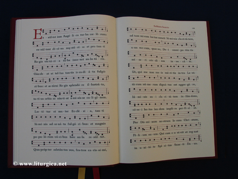
The Exsultet and Typesetting of the Notation
Traditionally, the Lectionarium contains also the Exsultet for the Easter Vigil. It is important, in this moment of highest solemnity, to avoid use either of a thick and unwieldy Missal or an unimpressive Ordo Hebdomadae Sanctae, almost always bound entirely in black.
For decades, the typesetting of Gregorian Chant has not been maintained and, therefore, not practiced to the extent it was for the old editions. Hence, despite our fully engineered world being replete with computers and other machines, there is still no software program or other solution capable of producing a typesetting of Gregorian Chant comparable in quality to the old editions of the Missal.
Though there are various approaches to this special typesetting, they fail at the outset even in the most basic detail: the print must be bicoloured, red lines and black notes. In addition, most solutions are devised for typesetting small chant books. A simple enlargement of the elements is impossible because the thickness of the lines, the distances of the elements and, primarily, the size of the notes - all these have different proportions when typesetting an Altar Missal. Finally these approaches do not provide the typesetter the complete freedom necessary for positioning the notes above the text.
In Gregorian Chant, the notes must be placed sometimes at the beginning, sometimes at the end, or sometimes at a different place above the syllable. In addition, the positioning also depends on other notes associated with the same word or sometimes even of the entire line.
Therefore, a completely new system had to be designed capable of producing results comparable to those of the hand typesetting used for former editions. As in the older process, the new system also required that each individual note and every single character had to be typeset by hand. On an average, this process took about a half hour per line!
The basic rule for typesetting the notes in Gregorian Chant is to position the note above the vowel of the syllable. Former liturgical publishers oriented themselves almost entirely on the vowels of the text beneath the notes. This resulted in uneven and sometimes very broad spacings between the notes and, therefore, in an uneven typeface that could easily distract the person chanting.
The Bremer Presse, however, chose a different approach. They oriented themselves according to a perfectly even positioning of notes in each line; that is, first they positioned the notes of a line with exactly the same spacing, and afterwards positioned the text according to the notes above it. The disadvantage of this method is that there is uneven spacing between the syllables of the text, sometimes broad spaces, sometimes tightly spaced
text.
For the Lectionarium, a compromise between both methods was chosen. For each word, all the notes associated with it have the same spacing. For the complete line, the spacings were adjusted only to one another. This has resulted in a typeface that, for the appearance of its evenness and beauty, is at least comparable the old editions.
|
|
Excursus: The Cutting of a Font
The Lectionarium, precisely like the Editio Lacensis, contains not only one, but a multitude of fonts. In addition to the main font, others are needed for the capitals and headings. A simple enlargement of the main font is unacceptable in the fine art of typesetting and, therefore, impermissible. The broadness of the lines of which the individual letter is composed decrease proportionally when the size of that letter increases. Therefore the letter would appear far too wide and aesthetically unpleasing. Simply for this reason, not only do all the lower and upper case characters of the alphabet have to be cut, but a multitude of letters as well. For the Editio Lacensis, every cut had about 1200 characters!
Today obviously the very lack of printers conversant with the complex techniques necessary for handlettering makes the use of computerized technology indispensable. Therefore for the cutting of a font, there has to be added another major achievement: the so-called kerning.
Kerning describes the relationship of two letters of a font to one another. For example, it is obvious that the lower case character r behaves towards the upper case character P differently from the way it does toward A. In former times, the spacing between the those pairs of letters were counted in layers of tissue paper (in order to standardize the relationship). Today, the font-cutter has to define all these spacings. Therefore, it takes countless attempts and prints of these pairs of characters - sometimes extremely enlarged - in order to work out the best and most appealing spacing and to define these for the later use of the font.
The fonts we use ourselves on our personal computers are so well developed, and the kerning so perfectly improved, that harmonic proportions and spacings seem natural to us. However, what a formidable amount of work is actually needed for a perfect kerning, and a beautiful font is entirely hidden for the viewer and user.
|
|
Excursus: Rationale for publishing a first edition of the Lectionarium according to the 1962-rubrics in the year 2009 (Indices)
Though there was never an official order calling for such publications, it fell mostly to the German Verlag Pustet, as perhaps the leading publishing house of liturgical books at that time, to edit a Lectionarium every few years after a new editio typica of the Missal was published.
Because of World War II and its aftermath, there had been no decent edition of a Lectionarium since 1940. Pustet did, however, print another edition in 1959; but this was only a small publication, and the number of copies printed was quite low. Its size, appearance and the volume printed, therefore, indicate that this was considered an interim solution, since everyone anticipated that more liturgical changes were forthcoming. But these changes came even more quickly than expected, through the promulgation of the Motu Proprio Rubricarum Instructum of Blessed Pope John XXIII in July, 1960. This Motu Proprio brought into force what are nowadays commonly referred to as the 1962 rubrics or the status of 1962, because the new rubrics came into effect with the beginning of the new liturgical year 1962. But in the new pontificate of Pope Paul VI, the inevitable missal and breviary editions were quickly followed by completely new bilingual editions of liturgical books in many countries.
Along with other factors, this dramatic development nearly caused the bankruptcy of the Verlag Pustet, and thus there has never been an edition of the Lectionarium according to the 1962 rubrics until 2009.
|